Harvest: An App for Farmers Market Shoppers
OVERVIEW
Design Question
How might we mitigate shopper confusion caused by the dynamic nature of information about vendors, products, and the market itself?
Solution
My team developed high-fidelity mock-ups for an app that provides users with vendor availability, product availability, as well as locations of nearby markets.
Project Details
Duration: 10 weeks in Fall 2018
Team: 4 person team
My Role: User Researcher and Designer
Tools: Figma, Adobe Illustrator, LucidChart, and Marvel
USER RESEARCH
Our team picked farmers markets as our research topic for this project because they are enjoyable, many people go to them, and there are plenty around the Seattle area. We picked the Ballard Farmers Market in Seattle for our user research due to the convenient location and time of the market.
Research at the Farmers Market
I conducted two semi-structured interviews with farmers market customers. Other members of my group conducted interviews with vendors. After some consideration between vendors and customers as our user group, we decided to focus our project on farmers market customers because they had more pain points.
“The other day I was hoping to find figs but figs aren’t in season anymore, so it makes sense why nobody had it.”
“Some markets have different things. I went to the one in Capitol Hill, and they didn’t have any produce at all. They just had art supplies and art work. I didn’t know that until I got there.”
Next, we conducted Walk-A-Mile research where we became customers and walked through the farmers market while interacting with vendors. I bought some honey after sampling different kinds! We also conducted Fly-On-The-Wall observations in which we observed the farmers market without interacting with anyone. These forms of research provided more insight into the behaviors of farmers market customers.
Product from a Farmers Market Vendor
Group Picture in the Halloween Themed Farmers Market
Key Insights from Interviews
Insight 1
Customers are unclear about information regarding products and their availability
Insight 2
Customers are unclear about information regarding vendors and their availability
Insight 3
There is no ability to compare information between different farmers markets
Competitive Analysis
I did a competitive analysis on Share Farm, a farmers market app. Based on my analysis, I thought it would be beneficial to focus on the community aspect of farmers markets in our product since that was important to customers based on our research and is not something that was a focus on Share Farm. This can provide a competitive edge to our product. I also found the interface of Share Farm to be cluttered and unintuitive, so those are areas I wanted to improve on in our product.
Personas
Our team picked two customer personas to focus on: a new customer and a customer that is familiar with the farmers market. We picked these two user groups based on our user research demographic.
Affinity Diagram Draft
Persona Draft
After getting feedback, we made a final version of our personas.
Persona 1: Farmers Market Frequenter
Persona 2: Non-native Newbie
User Journey Map
We made a user journey map for the experienced shopper persona based on our user research. The user journey map helped us compare pain points through a visual representation of our research insights.
User Journey Map
DESIGN QUESTION
How might we mitigate shopper confusion caused by the dynamic nature of information about vendors, products, and the market itself?
DESIGN PROCESS
We made storyboards, an information architecture, and paper prototypes prior to conducting a usability test. After analyzing the results from the usability test, we made wireframes. Prior to making the final designs, we came up with the name of the app, Harvest, and the visual language for the app.
Storyboards
We made storyboards to explore multiple ideas and envision key path scenarios that users would take at a farmers market. We decided that the solution would be a mobile application to allow users to access information about the farmers market anytime. The following are the storyboards I made:
Provide Users with Information about Payment Methods
Explore Multiple Markets
Other team members made storyboards for the following actions:
Connect farmers market customer with each another
Estimate how busy the market will be
Incentivize customers to return to the farmers market and to discover new vendors
Find food from grocery list at the market
Inform users about seasonal changes at the market
Give users more information about which vendors will be at the market each week
We decided to move forward with the following features:
Feature 1
Inform users about seasonal changes at the market
Feature 2
Allow users to explore different vendors confirmed for the market each week
Feature 3
Allow users to access information about multiple markets
Feature 4
Provide users with information about payment methods
Information Architecture
After finalizing the app features, we created an information architecture to decide the app structure. This involved deciding how to group features in the app, which is important for the user experience.
Information Architecture
Paper Prototypes and Usability Testing
We had three key tasks for usability testing, and we made paper prototypes for those screens.
Task 1
Check to see if the “Bonnie B’s Peppers” booth is at the Ballard Farmers Market this week. Determine which payment types they accept.
Task 2
Add “eggs” item to the grocery list and determine which vendors are selling them this week.
Task 3
Search for the University District Farmers Market, then bookmark it as a saved market.
We had list view and basket view user flows for Task 2, and I made the paper prototypes for the list view user flow shown below.
My Paper Prototype Screens for Task 2: Add “eggs” item to the grocery list and determine which vendors are selling them this week
We tested the paper prototypes with 5 customers familiar with the Ballard Farmers Market. We picked people who were familiar with the farmers market so that they could let us know whether this app would solve their pain points. We gained some key insights from the usability testing.
Insight 1
Users were able to check if a booth was confirmed for the week, but had difficulty figuring out what each payment icon meant
Insight 2
Users liked the ability to create a grocery list with icon and list view but had difficulties with determining which vendors sold the product
Insight 3
There was no overwhelming preference for the icon or list-based grocery list interface over the other
Insight 4
The home screen design was too information-heavy
Insight 6
The placement and presentation of icons within the interfaces needed more clarity
Insight 7
Contrary to our expectations, users tended to save a new market before previewing it
Wireframes
After gathering the usability testing insights, we decided to:
Remove information from the home screen to make it less cluttered and show more prevalent information
Change some tabs on the main navigation bar to facilitate viewing vendor and product information
Include a toggle option between the list view and icon view for the grocery list to provide users with options
Move the settings feature from the main navigation bar at the bottom of the screen to a gear icon at the top of the screen to increase intuitiveness
We brainstormed as a group to determine the general layout of the screen, font sizes, and a few icons.
I have included some wireframes for adding an item to the grocery list and viewing information about products. These are the primary screens that I worked on. The blue dots with numbers indicate the order of steps that the user has to take on the screen to complete the action.
Viewing and Adding to Grocery List
Viewing Product Information
We received positive feedback on our user flow. We also received feedback to increase our font size and fix some alignment issues.
Branding Choices
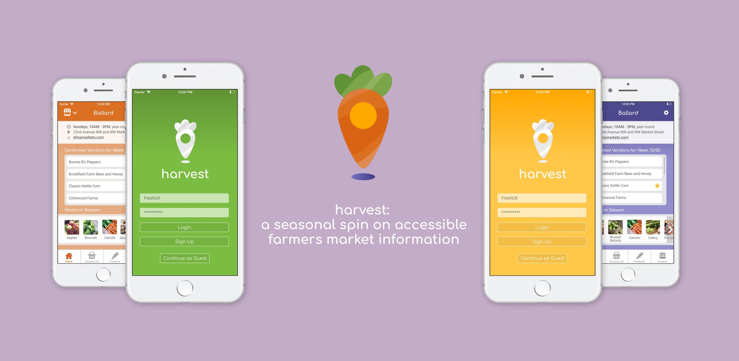
After evaluating different names for the app, we picked Harvest. The name Harvest is short and memorable while placing importance on the farmers’ contributions to farmers markets, making this an ideal name for this app.
We wanted to make the app feel friendly and welcoming. To accomplish this, we used vibrant colors, flat iconography, and rounded corners. We also used a rounded sans-serif typeface for the main headers to further evoke friendliness while maintaining readability. We used a carrot for the logo because it is easily recognizable, has vibrant colors, and is sold at farmers markets. We made it look like a location pin because one feature on our app is being able to find different farmers market locations, and it added uniqueness to the logo.
Logo
As the seasons change, so does product availability in the farmers market. In order to visually represent the concept of seasons changing in a fun and friendly manner, we decided to change the app’s main color scheme to reflect which season it is.
Winter Screen Color
Spring Screen Color
Summer Screen Color
Fall Screen Color
FINAL PROTOTYPE
Incorporating the wireframe feedback and branding choices, we made a final prototype of all the screens using Figma. We also made an interactive prototype using Marvel that shows all screens.
The following are the primary screens that I worked on.
To address the pain point of unclear information about products and their availability, we included a “What’s In Season” section on the market dashboard page. This section changes per season to reflect the produce available. We also included a Products tab with information about the products sold at the market and their availability in the upcoming week.
Screens from the Product Tab
Through the Grocery List feature, users can create a grocery list to use during their farmers market trip and personalize the information they receive about product availability. Based on usability testing feedback, in which some users preferred the list-based grocery list and others preferred the icon-based grocery list, we included a toggle feature for users to toggle between the list and basket view.
List and Basket View for Grocery List
REFLECTION
Upon completing this project, we did some reflection as a group and individually.
Next Steps
We would like to conduct usability testing in the future to improve upon the high-fidelity prototype. We would also like to design a vendor-facing app to allow vendors to easily update information about their availability and products. This could be done through a collaboration with the Neighborhood Farmers Market Association.
Key Takeaways
This was the first user centered design project that I have worked on from the user research phase to the final prototype phase. Here are my main takeaways:
User input is very valuable: By talking to customers, we were able to focus on real pain points rather than our assumptions.
Be open to feedback to improve designs: At almost every stage of the process, we did class critiques. I learned a lot from seeing other designs and considering the feedback given to our group.
Learn from your team members: Each team member had various strengths, and it was great to learn skills from them and teach them skills that I knew. One member was a strong visual designer, so I learned some design skills from her. combine I had background knowledge on how to use Figma so I was able to give tips on using the platform.
I hope to incorporate what I learned from this project in my future projects. I thoroughly enjoyed this process and I hope to do more of this research and design work in the future!