Friendstagram: Reimagining the Social Media Experience
OVERVIEW
Design Question
How can we direct Gen Z users towards active behaviors that lead to a positive mindset, regardless of their initial motivation to engage with an online platform?
Solution
My team developed high-fidelity mock-ups for design patterns that encourage users to use social media actively by connecting more with people important to them.
Project Details
Duration: 20 weeks in Winter and Spring 2020 (project mostly done remotely)
Team: 4 person team
My Role: UX Designer
Tools: Figma, Adobe Illustrator, Google Forms, and Microsoft Excel
USER RESEARCH
This project was sponsored by KLOA, a start-up that focuses on mobile human-computer interactions. Many users use social media platforms such as Facebook and Instagram in a passive way, mindlessly scrolling through posts. KLOA wanted to understand how to encourage users, specifically Gen Z users (ages 15-25), to be more mindful while using social media.
Literature Review
Our group analyzed peer-reviewed papers regarding this topic to better understand the problem space. We gathered insight into the psychological aspects of social media usage as well as design patterns for persuasive technology. We identified dark UX patterns and defined active social media usage as having direct exchanges with others.
User Interviews
We conducted user interviews to understand how online platforms affect users’ mood, mental state, and perceptions of themselves and others. We conducted 10 interviews with participants between the ages of 15-25 who had engaged with a social media and blogging platform in the preceding month. The interviews were analyzed using thematic analysis and the findings were used to inform the competitive content analysis and survey. Here are some quotes from the interviews:
“My online interactions now I feel like are a little more superficial. It’s harder for me to talk about like deep conversations with my friends over text than in person or you know, like through social media.”
“One really creepy time I was like was eating lunch with my friend and I was like, oh, nice shirt, and then I went on Facebook later and the shirt that he was wearing was in an ad, was very creepy.”
Competitive Content Analysis
This analysis was similar to a heuristic evaluation, but with a focus on evaluating the presence and severity of dark patterns based on our literature review rather than on general usability concerns. We evaluated three blogs (UX Collective, Alta Marfa, and Girl vs. Dough) and three social media platforms (Facebook, Instagram, and Snapchat), all mentioned by participants in the interviews, on common tasks that they mentioned doing on the platforms.
Endless scrolling was present on both social media and blog platforms. On blogs, this took the form of providing users with related articles to read after they finish the current article. On social media, this takes the form of new content loading continuously as users scroll down.
Disguised ads were found on social media platforms. Disguised ads make it more likely that users will view and interact with the ad because they might mistake it as regular content.
Disguised Ad on Snapchat
Diary Study
The motivation for conducting diary studies was to understand the mental and emotional states of users after engaging with online platforms. 5 participants, recruited through word of mouth, with a mean age of 22 participated in the day-long diary study. After every engagement with social media or blogs, participants filled out a survey with questions about their experience and how they felt after. At the end of the day, participants were asked to write a final reflection in the form of a "Love Letter" or "Break-Up Letter" to capture their perception of online platforms. Here are some quotes from the final reflection:
“Social media platforms are objectively really cool ways to explore lifestyles and places you haven’t even dreamed about.”
“I do have negative experience with social media, most notably in the form of FOMO- fear of missing out- or jealousy due to how others are portraying their lives.”
The qualitative data was analyzed using the codes generated during the thematic analysis for the interviews. The quantitative data was analyzed via descriptive statistics.
Survey
The motivation for the survey was to validate the findings from the previous research methods. 44 participants, recruited through word of mouth and snowball recruitment, took the survey. The qualitative data were analyzed using descriptive and inferential statistics and the quantitative data was analyzed using the codes generated during the user interviews analysis.
Key Insights from Research
We used the following insights to develop a design question to guide the rest of this project:
Insight 1
Engaging with social media is a part of daily routine for most users
Insight 2
Social media allows users to augment their relations with those in their immediate social circles
Insight 3
Social media allows users to stay connected with the world due to easy access to news, updates, and trends
Insight 4
Participants expressed a desire to become more selective about the type of content and people they interact with on social media
We also devised a mental model to capture a Gen Z user’s experience with online platform engagement:
Mental Model
DESIGN QUESTION
How can we direct Gen Z users towards active behaviors that lead to a positive mindset, regardless of their initial motivation to engage with an online platform?
DESIGN PROCESS
We started the design process by conducting an ideation session to come up with feature ideas to answer the design question. Then we explored the ideas using storyboards, wireframes, and high-fidelity design patterns.
Ideation
Based on our research, we found that participants had positive experiences with social media when engaging in the following actions:
Action 1
Expanding one's world view through seeing news or other informative content
Action 2
Actively engaging with friends and family
Action 3
Seeking out content for guidance, inspiration, or both
We came up with guiding questions for our affinity diagraming session to gather ideas on how to design social media to promote positive experiences.
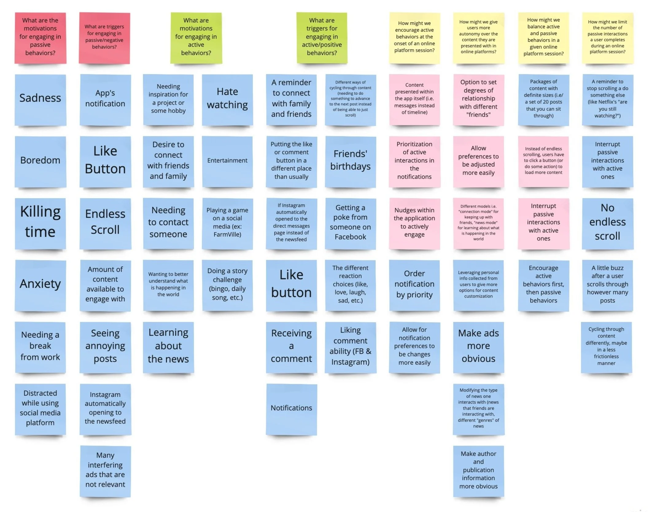
Affinity Diagram
After ideating and discussing the ideas, we chose three ideas to move forward with and continue to explore:
Idea 2
Landing Page Experience:
Prioritizing active engagement at the onset of a social media session
Idea 2
Nudge Feature:
Interrupting passive interactions in a timeline with active interactions
Idea 3
Group as Filters:
Setting degrees of relationship with different connections
Storyboards
For each idea we picked to move forward with, we made storyboards or screen ideas to visualize the idea and understand how it might be implemented. The storyboards provided a way to consider key user paths and discuss them as a group before beginning wireframes.
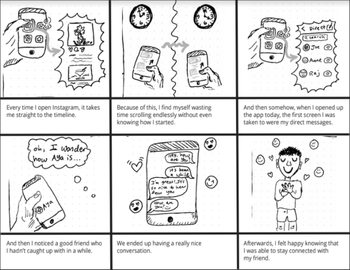
Storyboard for Landing Page Experience
Instead of the landing page of the social media platform being the timeline, the messaging page would be a better option to motivate users to catch up with connections instead of mindlessly scrolling through posts.
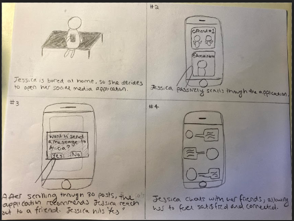
Storyboard for Nudge Feature
After passively scrolling through multiple posts on the social media platform, users will see a pop-up asking them if they want to do some active action such as messaging a friend.
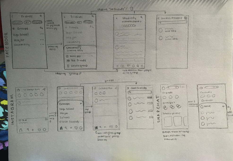
Screen Ideas for Group as Filters
Users will be allowed to make multiple groups with different members, such as one for High School Friends and one for College Friends so that they can easily post and view content from their intended audience.
Wireframes
Each designer on the team made screens without any set design language or template so that we could freely explore our ideas. Then, we came up with a loose template for the final wireframes so that we could use them for usability testing.
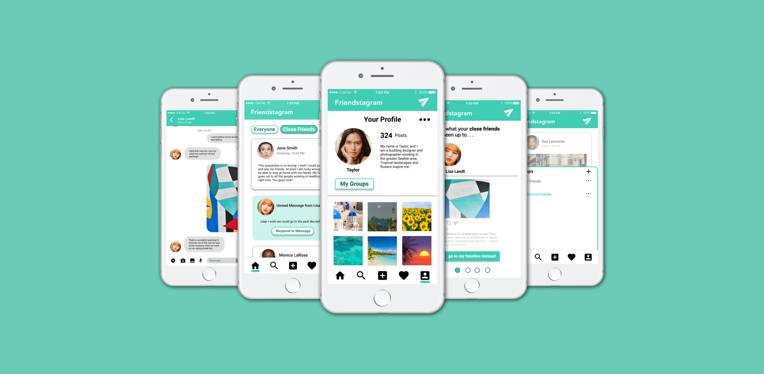
After talking to KLOA, our sponsors, we decided to create design patterns for a fake social media platform to demonstrate the features. We named the app Friendstagram and designed it to be a combination of Facebook and Instagram since those were the most used social media platforms based on our user research. This would allow users to focus on the features we are introducing rather than the platform itself so that we could get focused feedback from usability testing.
I was in charge of the nudge feature, so I will be focusing on my designs for the rest of the portfolio. I started by creating low-fidelity wireframes for the nudge feature.
Initial Wireframes for the Nudge Feature
After discussing the wireframes as a team, I designed medium-fidelity wireframes to use for usability testing.
Final Wireframes for the Nudge Feature
Usability Testing
We conducted a usability tests with four participants to evaluate our wireframes. The inclusion criteria were that the participant had to be between 15-25 years old and have accessed either Facebook, Instagram, or Snapchat at least once in the past month.
The usability test results led to the following design recommendations:
Design Recommendation 1
Depersonalize wording in the pop-up to be more general
Design Recommendation 2
Make the reminder subtler, either through changing it not to be a pop-up or positioning it at the bottom of the screen to be less obstrusive
FINAL PROTOTYPE
After implementing the feedback from the usability testing, we ended up with our final prototype. I have included images of the nudge feature screens below. We also made a video demonstrating all the features of the design patterns, which is embedded below, and a process book explaining our process and results in more detail.
Design Guidelines
We decided to use Google Material Design for guidance to unify our design.
Design Guidelines
Final Design for Nudge Feature
The nudge will come in the form of a visual pop-up notification that can be coupled with haptics or sound for accessibility.
Final Screens for the Nudge Feature
Video Demonstration of all Features
REFLECTION
This was the longest user-centered design project that I have been involved in. It is also the first time I have worked on a design project for a company. It was a great learning experience since it involved both teamwork and managing expectations from the sponsor. Although a lot of the project planning was done in person, this was the first time I completed the entire research and design process remotely.
Next Steps
It would be interesting to run multivariate A/B testing to test the effectiveness of these design patterns on existing social media platforms by collecting metrics such as time spent scrolling, time spent messaging, and user satisfaction (through a quick survey at the end of the user’s social media session).
Key Takeaways
Here are my main takeaways:
Combining multiple methods of user research is important: The diary studies combined with the interviews and survey gave a comprehensive understanding of what people like and dislike about social media and why.
Explore ideas even if they do not seem viable: In the beginning, our sponsors wanted us to explore blogs and social media platforms. Although our team did not think that blogs were very relevant to this project, exploring them allowed us to gain interesting insights. Even though we decided not to move forward with blogs for the designs, we made the decision based on user research instead of our assumptions.
I will strive to use what I learned from this project in my future projects. I thoroughly enjoyed this process and it was exciting to be in charge of designing a feature from start to finish!